Monday 16 December 2013

Embeddable economic indicator charts

Update: Unfortunately these charts are not currently being updated.

I've re-created the Headline Economic Indicators page on UK Data Explorer using D3. Improvements include:
  • The charts can now show more than one data series each.
  • The number and date formats have been improved (for example, the dates for monthly unemployment rate data now correctly show three-month periods such as Feb-Apr 2013).
  • Individual charts can be embedded on any site or blog using an iframe; instructions are here, and an example is below.

Wednesday 23 October 2013

A few visualisation links

  •  Andy Kirk's Visualising Data site has a useful section listing visualisation resources. The site also has an excellent blog, which includes a monthly selection of data visualisation links.
  • I've been learning ggplot2 recently; it is an excellent R library for creating static graphics. Both of the books listed on the ggplot2 home page are very good (although I haven't read either from cover to cover). Some of the information in the R Graphics Cookbook is available online at Winston Chang's Cookbook for R site.
  • If you haven't used R before, Paul Teetor's R Cookbook could be a good place to start. R in Action (Robert Kabacoff) and The Art of R Programming (Norman Matloff) also get good reviews, but I haven't read either of these two.
With coursework and wedding planning, I'm not likely to have time to write many posts over the next few months.

Wednesday 9 October 2013

Experimental interactive Census maps of English wards

I've put maps for all of the English regions online here. They're at a very early stage, but hopefully there aren't too many bugs! I made use of Alex Singleton's Open Atlas Project code for downloading and reshaping the data.


Monday 7 October 2013

Mapping 2011 Census Data for England and Wales

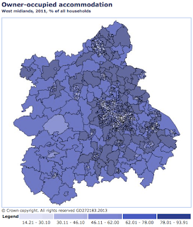
In addition to labour market statistics, Nomis includes detailed data tables for England and Wales from last four censuses. The site has a handy built-in mapping tool. As an example, here's how to create a map of home ownership in West Midlands. (The image is a screenshot using Nomis's medium size option. The maps quality is even better in extra large size.)
  1. Go to the Census data page (also linked to from the Nomis home page).
  2. Choose Key Statistics, then select Tenure from the list.
  3. In the left column, under Explore, click Advanced Query.
  4. In the geography section, choose select areas within, then select 2011 super output areas - mid-layer in the second drop-down list. From the options that appear, choose regions  and West Midlands.
  5. In the tenure section, select only Owned.
  6. In the percent section, tick percent.
  7. In the format/layout section, select Map.
  8. Click download data, then View map.
The Office for National Statistics has a page of Census visualisations. Alex Singleton at the University of Liverpool has created an atlas of Census maps for each local authority area using Nomis downloads and R.

ONS's Census data publishing strategy is here.

Monday 30 September 2013

Renewable electricity sites mapped

Interactive maps of UK renewable electricity generating sites are published by the Department of Energy and Climate Change and RenewableUK. I've had a go at creating a slightly different style of interactive map with the DECC data, with circles sized in proportion to electricity generating capacity.

You can view one type of generation at a time by hovering over the legend. The north-south differences (for example in wind, hydro and solar generation) are striking but not completely surprising given the differences in climate and landscape.


The map uses D3 and Leaflet, and the code is based on this page by Mike Bostock.

Thursday 26 September 2013

A big list of Office for National Statistics publications

I've put together a categorised list of over 100 regularly-published Office for National Statistics releases, covering topics including the economy, demography, and health. It's hopefully helpful as a quick overview of the breadth of information that's published.

Monday 23 September 2013

Sankey Diagrams

Sankey Diagrams are useful for showing flows, such as energy flows or movements of people. My favourite example is the Energy Flow Chart, produced annually by the UK's Department of Energy and Climate Change.
Versions of the chart going back to 1974 are available from the National Archives. It's interesting to see the shift from coal to gas and the reduction in energy consumption by industry over this period. Note that different units are used in the 1974 and 2012 charts; 1 toe equals approximately 397 therms (DUKES 2013 page 229). 
DUKES Annex H includes detailed flow charts for individual fuels.

There's an entire blog on Sankey diagrams at sankey-diagrams.com, which is useful for inspiration and for advice on design. The site includes a list of software for creating the diagrams.

The D3 Sankey plugin is fairly easy to use if you know some JavaScript; see Mike Bostock's example. The 2012 UK flow chart (above) was created in Adobe InDesign.

Friday 20 September 2013

A map of the Welsh Index of Multiple Deprivation

I published a map of deprivation in Wales yesterday, using data from the Welsh Index of Multiple Deprivation 2011.
In my previous posts on deprivation maps, I have focused on the map design themselves rather than the important information that the maps contain. This is simply because I feel more qualified to comment on the presentation rather than the data itself.

Alasdair Rae's site on the Scottish index has an explanation page which is useful for gaining a better understanding of deprivation maps in general. The Welsh Government's WIMD 2011 page includes a guidance document which explains how the deprivation indices are calculated.

The Joseph Rowntree Foundation yesterday published a report on poverty and social exclusion in Wales.

Wednesday 18 September 2013

World Development Indicators

World Development Indicators is a database compiled by the World Bank, containing 1289 indicators (by my count) in the categories of world view, people, environment, economy, states and markets, and global links. The database covers the world, regions, and countries, contains annual data, and is updated in April, July, September and December each year. Edit: There are also some updates between these dates; see here for details.

Data visualisation tools are available for a selection of the indicators, including Google Public Data Explorer. There are also nice mobile apps for viewing the indicators.

There are a few options for downloading data:
  • The Databank is an online tool for selecting, viewing and downloading data.
  • The WDI package for R can be used to search for and download data directly to R. See the README page for a quick tutorial.
  • There is also a zip file containing all of the data and metadata in csv format (39 MB download). This could be useful if you plan to use the WDI often.

Tuesday 17 September 2013

A map of the Scottish Index of Multiple Deprivation

The screenshot below shows my interactive map of SIMD 2012, which is based on the design I used previously for a map of London.

I am aware of three existing interactive maps that use this data set:
  • The Scottish Government's map has many features, including the ability to show changes over time. The map's downside is that it uses only a relatively small portion of the browser window.
  • Alasdair Rae's site was obviously a major source of inspiration for mine. The map's tooltips show change in rank over time, and the site also has some advice on interpreting the maps.
  • Oliver O'Brien's map uses an unusual and effective technique of shading only buildings.
I've also created a visualisation of the the SIMD ranks of data zones in each local authority area, based on the barcode charts in the Scottish Government's SIMD publication.

Monday 16 September 2013

Eurostat data in R

Eurostat, the statistical office of the European Union, collects and publishes national and regional data for Europe. The site's features include Regional Statistics Illustrated, a data tool with interactive maps and charts and Statistics Explained articles.

It's possible to download data from the Eurostat database to carry out your own analysis and visualisation. There are two possible approaches to this:
  1. The browse/search page. Within this, the Database sections are customisable, while the Tables are ready-made. The advantages of downloading data by this route is that very little processing is required to get the data in the correct shape. The disadvantage is that you need to use a web browser to get data rather than downloading straight to software such as R. But the process can be made very quick by using bookmarks.
  2. From the bulk data downloads section, you can download full datasets for use in statistical software.
I'll begin by discussing option 1. When you click on a dataset from the browse/search page, a new window opens (see screenshot). In this window, you can choose the variables, countries etc that you are interested in.

To find out more about the dataset, click "Explanatory texts (metadata)".

It's possible to bookmark your data selection for future use.

To download the data for use in a stats package, click the Download button and choose to download in csv format.

This is an example script for plotting data downloaded from Eurostat. Here is the result:

For downloading from the bulk facility, this is useful blog post by Johannes Kutsam. Here is an example script I wrote using Johannes's function. The result is very similar to the chart above, although for some reason estimated values seem to be missing from the downloaded data.

Wednesday 11 September 2013

Using the Nomis API with R for regional labour market data

Nomis, a site run by the University of Durham on behalf of the Office for National Statistics, is a fantastic source for labour market statistics, including local data.

The site's features include regional profiles and web-based tools for querying the Nomis database. In this post, I'll briefly discuss the Nomis API, which is useful for downloading the latest data to stats software, web apps etc. Spencer Hedger, who works on the Nomis team, has written several helpful blog posts on using the API. Also see the API reference pages which are linked to from your Nomis account page.
Chart created using R and Nomis API

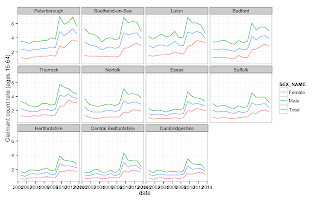
This is a quick example of downloading data to R using an API link. The API link was generated using the process described in Spencer Hedger's blog post; see the link above. The resulting chart is shown to the right.

The API has several format options in addition to CSV, such as Google Visualisation JSON and KML.

Wednesday 4 September 2013

ONS time series data in R

The datasets on the Office for National Statistics website contains thousands of economic time series. It's straightforward to select series by hand and download a CSV file of the data. Better still, because these CSV downloads have a consistent naming pattern, you can download the variables of your choice into a program like R if you know the variable and dataset codes you're looking for.

I've created this R script as an example of downloading data directly to R. It only takes a few lines of code to download the data to R and remove the metadata at the end of the file. The script also adds a bit of additional microdata to make the numbers easier to work with, and reshapes the data to make it tidy. Finally, it plots a few employment rate charts:
employment rate

A pitfall of this approach to downloading data is that some variables such as GDP are published in different datasets depending on the month (preliminary estimate, second estimate etc.).

Rather than getting the data directly from ONS, you could try the Quandl API (HT: jamesz). I've only just started using Quandl, but it seems like a great resource and has data from hundreds of sources.

Friday 30 August 2013

Colour schemes for maps and charts

A few useful resources:
  • Colorbrewer: hand-picked colour schemes by Cynthia Brewer, designed for maps but also useful for other visualisations. All of the palettes are available in the RColorBrewer package for R. This is a useful introductory paper on data maps by Cyntia Brewer.
  • Escaping RGBland is a paper by Zeileis, Hornik and Murrell describing principles for creating your own Colorbrewer-like schemes. Section 6 describes the colorspace package in R, which makes it easy to put the paper's principles into practice.
  • The Cookbook for R includes a couple of nice simple colourblind-friendly palettes, based on this page on Color Universal Design.
  • I Want Hue is a good tool for creating categorical palettes.
  • Here is a much more comprehensive list of resources from Visualising Data.

Monday 26 August 2013

Sparklines for time series economic data


Sparklines make it possible to fit a huge number of data points in a small space. I recommend Edward Tufte's chapter from Beautiful Evidence (image, left) and Stephen Few's article on scaling sparklines.

While planning my dashboard page, I came across a number of sites that use sparklines for economic indicators, including the home page of FRED. FRED is a fantastic economic data site that makes it very easy to find data on the US economy and beyond. These sparklines fit quite a bit of data in a small space, and a more detailed chart appears on hovering the mouse. I think that the charts could be improved, however, by a bit more information about scaling. Each chart shows approximately ten data points, and it would be useful to add 'last 10 months' or 'last 10 quarters' etc below each chart. Two numbers could also be added to the left of each chart to show the minimum and maximum values. Finally, the vertical scale could be expanded slightly to fill the space available.

Friday 23 August 2013

Mapping deprivation

These are some of maps I took inspiration from for the design of my map of deprivation in London. I'm not an expert cartographer, so the end result of my map is not as good as these in many respects.

Alastair Rae's maps (including this one of Scotland) inspired me to try using Fusion Tables for choropleth mapping in the first place. Rae is an expert on maps, and his designs and colour schemes are very clear. One of my favourite features of the Scotland map is the full-screen mode.


The Scottish Government's SIMD map has several useful features, including a transparency slider, several options for colour banding, and comparison of areas.

The Data Visualisation Team at the Office for National Statistics have dozens of well-designed visualisations on their Interactive Content page. The Atlas of Deprivation is entirely SVG-based rather than using a detailed map background. The result is a map that responds very quickly to user interaction. The map has several great features including the option to show a local rather than national comparison. The image here shows ONS's legend design. I based my legend on this. Incidentally, I liked this interview with Alan Smith from the ONS team.

I borrowed a number of ideas for features and page design from the Open Data Communities map of England.

Visualisations from the New York Times are consistently excellent. One thing I've picked up from the NYT's maps is that the background to a semi-transparent choropleth map should be white to avoid misleading colour blends. See this map of Netflix queues for an example.

Another New York Times map has place names above the data. This got me thinking about how to make the base map and text as legible as possible. First, I added some transparency options so that the user can choose between brighter colours and a more legible basemap. Secondly, I brightened up the colours (which I got from Colorbrewer) slightly so that they would appear bright even after being made slightly transparent. It didn't make as much difference to the end result as I had hoped, but I can provide the details if anyone would find it helpful.


I really like this map by Oliver O'Brien, which only colour-codes the area occupied by housing, but I'm not skilled enough to do anything similar!



Monday 19 August 2013

UK economic dashboard

The Office for National Statistics publishes thousands of long-run economic data series in machine-readable CSV and XML formats. Although the download facility on the ONS website is incredibly useful, it can sometimes take a bit of effort to find the latest data for a given variable, and the site does not yet have a quick way to visualise the data.

With these things in mind, I created the UK Data Explorer dashboard page to provide a quick way to view economic indicators. The page includes ONS's list of over 50 key time series indicators, and it is also possible to search for a variable by name or code from a much wider list. The page provides a link to your customised dashboard, to make it easy to return at a later date and check the progress of indicators. For example, this dashboard shows seven headline indicators on the labour market, GDP and inflation.

The page is still in beta, and there are several features I hope to add in the near future, including the ability to show multiple variables on the same graph and more descriptive variable names and metadata. Please let me know if there are any features that you would find useful.

Some technical details
The site uses a script to check for updates on the ONS website a few minutes after the 9.30 publication each day. The script downloads the CSV file of each new dataset, and places the data and metadata in database tables. The dashboard page uses HTTP requests to PHP scripts to access the data in these tables.

Thursday 15 August 2013

Uploading UK boundary maps to Google Fusion Tables

Here goes my first attempt at blogging! I thought I'd jot down a few notes on importing UK maps to Google Fusion Tables. There's loads of information online on creating maps (for example here), so I won't cover the basics of Fusion Tables.

A good place to start looking for boundaries is this blog post from Simon Rogers, which has several ready-made maps. If you don't find what you need there, try ONS's Open Geography Portal. The 'Download Boundaries' section is one option, but I find it's handier to use the 'Browse' section, then Digital Boundaries. Within this section, choose a geography type from the left panel, and select Details in the right panel. (Generalised files are smaller but less detailed than Full files. Clipped files are clipped to the coastline.)

Finally, scroll to the zip download, which is among the Transfer Options links.

You can then upload the shapefile to Fusion Tables using Shape Escape. As an alternative, I've found the rgdal package in R to be useful. This is an example script to create a KML file for uploading to Fusion Tables:

library(rgdal)
shapeFileName <- 'LAD_DEC_2010_GB_BGC.shp'
layerName <- ogrListLayers(shapeFileName)
ogrInfo(dsn,layerName)
shp <- readOGR(dsn=shapeFileName, layer=layerName)
shpWGS84 <- spTransform(shp,CRS("+proj=longlat +datum=WGS84"))
writeOGR(shpWGS84, "LA.kml", layer="LA",driver="KML")


You can also join data to the geographical boundaries in R, using the shp@data data frame. I don't have much experience of doing this, but I'd recommend trying the  join function from the plyr package.

For map colours, I'd recommend http://colorbrewer2.org/.

This is my first attempt at using D3 and Fusion Tables together for a map. I might cover some more details of this in another blog post, or feel free to ask!