Tuesday 11 November 2014

Interactive map of Census 2011 data for Scotland


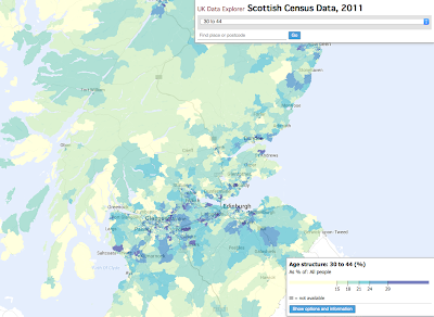
The interactive Scottish Census Map includes many of the variables from Release 2A, covering topics such as age, marital and civil partnership status, national identity, language and religion. The map was created using the the Google Maps API's recently-added feature for displaying GeoJSON data.

http://ukdataexplorer.com/scotland-census-map/

I'm not sure if any similar maps of Scotland are already available - let me know if I've missed something! The creators of the excellent DataShine are hoping to add Scottish data to their map in the near future.

Let me know if you find the map useful or if you have any suggestions for extra features.

Friday 24 January 2014

European word translator

I'm a big fan of the etymology maps on reddit. These gave me the idea of creating a map that would translate any English word (or two) to other European languages using Google Translate. The results are often far from perfect - the screenshot below shows that "a bug in a rug" becomes "an error in a rug" in Spanish. This may be partly because Google Translate has little context to work with when only one or two words are entered, and partly because it just isn't as smart as a human translator. Still, hopefully it's fun to play with!

http://ukdataexplorer.com/european-translator/


Treemaps of emissions and Reddit posts


A couple of my recent experiments have been treemap visualisations using D3. Treemaps are useful for showing part-to-whole relationships when there are many data points and the data points can be categorised (countries by continent, stocks by sector and sub-sector etc). The Map of the Market is a nice example.

The interactive treemap I created of emissions and population is shown below. I think it does a reasonable job of showing the data, but perhaps it could be improved by dividing the countries into categories such as continents. I also wonder if side-by-side bar charts might be a simpler better way to show the data.

My other treemap shows the top 200 reddit posts of all time. It's just a bit of fun, but I'm not sure if it's really a successful visualisation; to me, the design of a treemap implies the relationship of parts to a whole, but in this treemap "the whole" is arbitrarily chosen to be only the top 200 posts.

For more information and links on treemaps, see this article by their inventor, Ben Shneiderman.